How to Make a Scatter Plot With Excel?
Are you looking for an easy way to create a scatter plot with Excel? Scatter plots are a great way to visualize data, and creating them with Excel is quick and easy. In this article, we’ll show you how to make a scatter plot with Excel and provide tips for customizing it to best represent your data. Read on to learn more!
- Open a new or existing Excel spreadsheet.
- Enter your data into two columns and label each column.
- Select the data columns and click the “Insert” tab on the ribbon.
- Click the “Scatter” button under the “Charts” section.
- Choose the type of scatter plot you would like to make.
- Press “OK” to create the chart.
- Adjust and format the chart as desired.
Understanding How to Make a Scatter Plot with Excel
Scatter plots are a useful way to display data points that have two or more variables associated with them. Excel is one of the most popular programs used to create scatter plots and other graphical representations of data. The following steps will help you understand how to make a scatter plot with Excel.
Step 1: Prepare the Data for the Scatter Plot
The first step in making a scatter plot with Excel is to prepare the data. This means creating a spreadsheet that has two columns, one for each of the variables associated with the data points. The data should be structured so that the first column contains the x-coordinate values and the second column contains the y-coordinate values. It is also important to make sure that the data is properly formatted, such as ensuring that all of the numbers are listed as “numbers” instead of “text.”
Step 2: Select the Data and Insert the Scatter Plot
Once the data has been prepared, it is time to create the scatter plot. To do this, select the two columns of data and then click the “Insert” tab at the top of the Excel window. In the “Charts” section, select the “Scatter” option and then select the type of scatter plot you want, such as “Scatter with only Markers” or “Scatter with Smooth Lines and Markers.”
Step 3: Customize the Scatter Plot
Excel provides several options for customizing the scatter plot. This includes changing the colors, labels, and markers used in the plot. It is also possible to add trend lines, error bars, and add additional data points to the plot. To access these options, right-click on the plot and select the “Format” option.
Working with Data in Excel
Once the scatter plot has been created, it is possible to work with the data in Excel. This includes adding additional data points, changing the labels and colors, and adding trend lines and error bars. It is also possible to save the scatter plot as an image file, such as a PNG or JPG file.
Adding Additional Data Points
Excel makes it easy to add additional data points to the scatter plot. To do this, simply select the “Insert” tab and then select the “Data Point” option. From here, you can enter the coordinates for the new data point into the appropriate fields.
Changing the Labels and Colors
It is also possible to change the labels and colors used in the scatter plot. To do this, right-click on the plot and select the “Format” option. From here, you can change the labels, colors, and markers for the data points.
Saving the Scatter Plot
Once the scatter plot has been created and customized, it is time to save it. To do this, click the “File” tab and then select the “Save As” option. From here, you can select the file type you wish to save the scatter plot as, such as a PNG or JPG file.
Conclusion
Creating a scatter plot with Excel is a simple process. The key is to prepare the data correctly, select the data and insert the scatter plot, and then customize the plot. Finally, it is important to save the plot as an image file. With these steps, you can easily create a useful scatter plot with Excel.
Top 6 Frequently Asked Questions
How to Make a Scatter Plot With Excel?
Q1. What is a scatter plot?
A1. A scatter plot is a graph that uses dots or points to show the relationship between two variables. The dots are plotted on a graph and provide visual representation of the relationship between the two variables. They can be used to explore relationships between variables and can also be used to predict trends and outliers.
Q2. What is the process for creating a scatter plot in Excel?
A2. To make a scatter plot in Excel, start by opening your workbook and selecting the worksheet that contains the data you want to plot. Next, select the two columns of data you want to plot. To do this, click on the first column heading, hold down the shift key and click on the last column heading. Then, go to the Insert tab, click on the ‘Scatter’ option and select the ‘Scatter with Data Markers’ icon. The scatter plot will then be displayed on your spreadsheet.
Q3. What is the purpose of a scatter plot?
A3. The purpose of a scatter plot is to explore the relationship between two variables. It is a useful tool for identifying trends, outliers, and correlations between two variables. It can also be used to predict future behavior based on current trends.
Q4. What are some of the features of a scatter plot?
A4. A scatter plot is composed of dots or points that are plotted on a graph. When creating a scatter plot, you can select the size and color of the dots, as well as the range of the x and y axis. You can also add a trend line to the graph to show the general trend of the two variables.
Q5. How can I customize my scatter plot?
A5. You can customize your scatter plot by selecting the size and color of the dots, as well as the range of the x and y axis. You can also add a trend line to the graph to show the general trend of the two variables. Additionally, you can add labels to the graph to highlight specific points and add titles to the graph to explain what it represents.
Q6. What are the best practices for creating a scatter plot?
A6. The best practices for creating a scatter plot are to make sure that the data is accurate, that the axes are properly labeled, and that the points are clearly visible. Additionally, it is important to make sure that the axes have the same scale and that the points are not too close together, as this could make it difficult to interpret the data. Finally, it is important to make sure that the trend line is clearly visible, as this can help to identify emerging trends.
How to Make a Scatter Plot in Excel
Making a scatter plot with Excel is a simple process that can be used to quickly and easily visualize data. With its intuitive user interface, Excel allows users to create scatter plots with minimal effort. With a few simple clicks, users can create a visually appealing graph that accurately depicts the relationship between two variables. Whether you’re creating a chart for your business presentation or for your science class, Excel’s scatter plot tool can help you quickly and easily analyze and present your data.
By following the steps outlined above, you can easily create a scatter plot with Excel. Whether you’re a beginner or a professional user, this powerful tool can help you visualize data in a visually appealing and easy to understand way. Excel’s scatter plot tool is a great way to quickly and accurately analyze and present data.
How to Cross Out Text in Excel?
How to Reset Microsoft Word to Default Settings?
Related Posts

Small businesses struggle with ERC tax credit submissions

10 Misunderstandings of the Employee Retention Credit
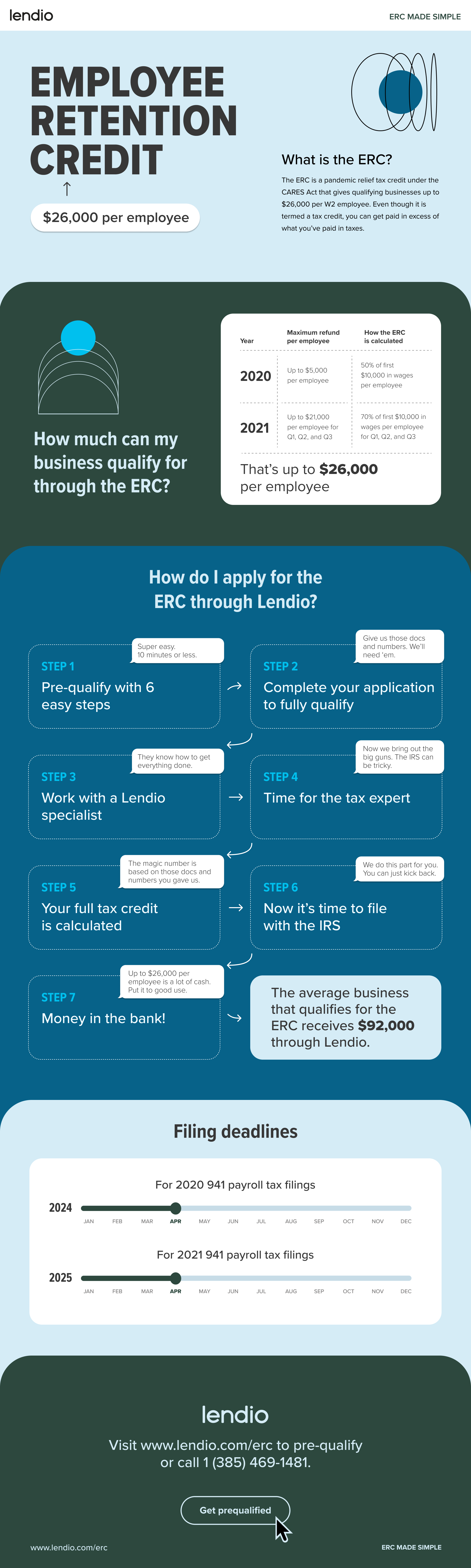
ERC Tax Credit 2023: Is the ERC tax credit still available?