How to Change X Axis Labels in Excel?
If you’re looking for an easy way to change the labels on your X-axis in Excel, you’ve come to the right place. In this article, we’ll walk you through the steps needed to change the labels of your X-axis in Excel. We’ll also discuss the differences between changing the labels manually and using an automated method. By the end of this article, you’ll have a better understanding of how to customize your X-axis labels in Excel. So let’s get started!
Changing X Axis Labels in Excel is easy. Here’s how:
- Open the Excel spreadsheet containing the chart you wish to edit.
- Select the chart, then click the “Design” tab located at the top of the Excel ribbon.
- Click the “Select Data” button, which will open the “Select Data Source” window.
- In the “Horizontal (Category) Axis Labels” section, click the “Edit” button.
- Enter the new labels into the “Axis Labels” field, separating each label with a comma.
- Click “OK” twice to save your changes.

Changing Labels on the X Axis in Excel
Excel is a powerful spreadsheet application that can be used to create charts, graphs, and other visualizations. One of the most important aspects of these visualizations is the ability to properly label the X axis. This article will provide a step-by-step guide to changing the labels on the X axis in Excel.
The first step is to open your Excel workbook and select the chart or graph you want to modify. Once the chart is open, right-click on the X axis and select “Format Axis”. This will open a dialog box where you can edit the labels on the X axis.
Creating New Labels
In the dialog box, you can enter new labels for the X axis. If you want to enter multiple labels, separate them with a comma. You can also select a range of cells from the spreadsheet to use as labels. When you’re finished entering the labels, click “OK” to apply them.
Editing Existing Labels
If you want to edit existing labels on the X axis, you can do so by double-clicking on the label in the chart. This will open a dialog box where you can edit the label. When you’re finished, click “OK” to apply the changes.
Formatting Labels
You can also format the labels on the X axis. To do this, select the label in the chart and then click the “Format” button. This will open a dialog box where you can format the label. You can change the font, size, color, and alignment of the label. When you’re finished, click “OK” to apply the changes.
Deleting Labels
If you want to delete a label on the X axis, simply select the label and then press the “Delete” key on your keyboard. This will remove the label from the chart.
Moving Labels
You can also move labels on the X axis by selecting the label and then dragging it to a new location. The label will remain in its new location until you move it again.
Conclusion
Changing labels on the X axis in Excel is a simple task that can be accomplished in a few steps. Once you know how to do it, you can easily customize your charts and graphs to better communicate your data.
Frequently Asked Questions
What is an X-Axis in Excel?
An X-Axis in Excel is the horizontal axis of a chart or graph. It typically displays a value or category along the horizontal line. For example, if the X-Axis is displaying a timeline of events, each bar or point on the graph would represent a certain point in time.
How Do I Change the X-Axis Labels in Excel?
The easiest way to change the X-Axis labels in Excel is to click on the chart, then click on the “Select Data” button in the “Chart Tools” section of the ribbon. In the “Select Data Source” window, click on the “Edit” button next to the Horizontal (Category) Axis Labels. This will open a new window where you can edit the labels. You can also change the font size, color, and alignment of the labels here.
How Do I Change the Intervals on the X-Axis in Excel?
To change the intervals on the X-Axis in Excel, click on the chart, then click on the “Axes” button in the “Chart Tools” section of the ribbon. In the “Axes” window, click on the “Horizontal Axis” tab and then click on the “Scale” tab. Here you can change the major and minor units of the X-Axis, as well as the maximum and minimum value.
How Do I Change the Title of the X-Axis in Excel?
The title of the X-Axis in Excel can be changed by clicking on the chart, then clicking on the “Axes” button in the “Chart Tools” section of the ribbon. In the “Axes” window, click on the “Horizontal Axis” tab and then click on the “Title” tab. Here you can change the text of the title, as well as the font size, color, and alignment.
How Do I Hide the X-Axis Labels in Excel?
To hide the X-Axis labels in Excel, click on the chart, then click on the “Axes” button in the “Chart Tools” section of the ribbon. In the “Axes” window, click on the “Horizontal Axis” tab and then click on the “Labels” tab. Here you can uncheck the “Show Labels” box to hide the labels.
How Do I Change the Orientation of the X-Axis Labels in Excel?
To change the orientation of the X-Axis labels in Excel, click on the chart, then click on the “Axes” button in the “Chart Tools” section of the ribbon. In the “Axes” window, click on the “Horizontal Axis” tab and then click on the “Labels” tab. Here you can select either “Rotated” or “Vertical” for the orientation of the labels. You can also change the font size, color, and alignment of the labels here.
How to Change Horizontal Axis Values in Excel 2016
Making changes to the X axis labels in Excel is a simple process that will allow you to quickly customize your data for increased readability. With a few clicks of the mouse, you can easily change the appearance and content of your labels, allowing you to more accurately convey the information in your chart. By taking the time to tailor the X axis labels to your data, you can make sure that you are providing the most meaningful and legible chart possible.
Related Posts

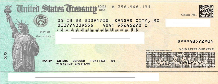
Small businesses struggle with ERC tax credit submissions

10 Misunderstandings of the Employee Retention Credit
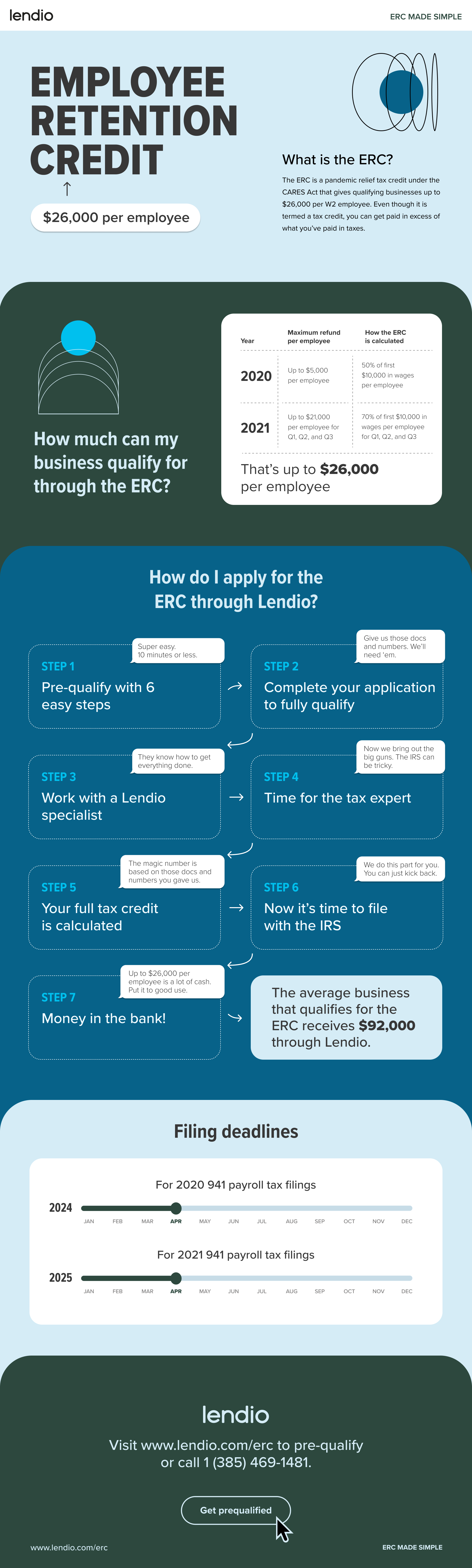
ERC Tax Credit 2023: Is the ERC tax credit still available?