How to Make a Graph in Powerpoint?
Creating a graph in Powerpoint can be a great way to present your data in an eye-catching and visually appealing way. Whether you’re creating a presentation for a class, a business presentation, or a personal project, knowing how to create a graph in Powerpoint can help you get your message across and make a lasting impression. In this guide, we’ll walk you through the step-by-step process of creating a graph in Powerpoint, from selecting the type of graph to formatting it for maximum impact. By the end of this guide, you’ll have all the tools and information you need to make your graph look and perform its best. Let’s get started!

Creating a Graph in PowerPoint
Creating a graph in PowerPoint can be a great way to visualize data and present it in a clear and concise way. It’s easy to create a graph in PowerPoint, but there are a few important steps to follow in order to create a graph that looks professional and is easy to read. In this article, we will go over how to make a graph in PowerPoint.
Step One: Input the Data
The first step to creating a graph in PowerPoint is to input the data that you want to visualize. This can be done by either typing the data into a table or by importing data from an external source such as an Excel spreadsheet. When inputting the data, make sure to use the correct labels for each set of data. This will make it easier to read and understand the graph when it is completed.
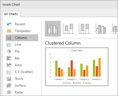
Step Two: Choose a Graph Type
Once the data has been inputted, the next step is to choose a graph type. PowerPoint has a variety of graph types to choose from, including bar graphs, line graphs, pie charts, and more. It is important to choose a graph type that accurately reflects the data being visualized. For example, if the data is showing a comparison between two different sets of data, a bar graph would be the most appropriate graph type.
Step Three: Customize the Graph
The third step to creating a graph in PowerPoint is to customize the graph. This includes adding colors, labels, and titles to the graph. It is important to make sure the graph is clearly labeled and easy to read. Additionally, it can be helpful to add colors to the graph to make it more visually appealing.
Step Four: Insert the Graph
Once the graph has been customized, the next step is to insert the graph into the PowerPoint presentation. This can be done by selecting the “Insert” tab and then choosing the graph type from the drop-down menu. After the graph has been inserted, it can be moved and resized to fit the presentation.
Step Five: Finalize the Graph
The final step to creating a graph in PowerPoint is to finalize the graph. This includes making any final adjustments to the graph such as adding labels or legends. It is also important to check the accuracy of the graph and make sure all of the data is displayed correctly. Once the graph is finalized, it is ready to be presented.
Related FAQ
How do I create a graph in Powerpoint?
Creating a graph in Powerpoint is easy and straightforward. The first step is to select the “Insert” tab from the top menu bar and then select “Chart” from the options provided. From here, you can select the type of chart you would like to create. Then, select the data that you would like to include in your graph, such as numbers, ranges, or categories. Once you have selected the data, you can customize the graph to your specifications, such as the size and color. Finally, you can save your graph to the slide or copy it from the slide and paste it elsewhere.
How do I edit an existing graph in Powerpoint?
Editing an existing graph in Powerpoint is also easy and straightforward. First, select the graph by clicking on it. This will open the “Format Chart Area” window, which will allow you to modify the graph’s size, color, and other options. You can also select the “Chart Tools” tab at the top of the window to customize the graph further. If you would like to add or remove data from the graph, you can do so by selecting the “Select Data” button and then selecting or deselecting the data you would like to include or exclude.
How do I add a legend to my graph in Powerpoint?
Adding a legend to your graph in Powerpoint is also easy and straightforward. First, select the graph by clicking on it. This will open the “Format Chart Area” window, which will allow you to add a legend. To add a legend, select the “Chart Tools” tab at the top of the window and then select the “Layout” option. In the “Layout” window, select the “Legend” option and then customize the legend to your specifications.
How do I add a title to my graph in Powerpoint?
Adding a title to your graph in Powerpoint is easy and straightforward. First, select the graph by clicking on it. This will open the “Format Chart Area” window, which will allow you to add a title. To add a title, select the “Chart Tools” tab at the top of the window and then select the “Layout” option. In the “Layout” window, select the “Chart Title” option and then type in your desired title.
How do I add data labels to my graph in Powerpoint?
Adding data labels to your graph in Powerpoint is also easy and straightforward. First, select the graph by clicking on it. This will open the “Format Chart Area” window, which will allow you to add data labels. To add data labels, select the “Chart Tools” tab at the top of the window and then select the “Layout” option. In the “Layout” window, select the “Data Labels” option and then customize the labels to your specifications.
How do I change the style of my graph in Powerpoint?
Changing the style of your graph in Powerpoint is also easy and straightforward. First, select the graph by clicking on it. This will open the “Format Chart Area” window, which will allow you to change the style of your graph. To change the style, select the “Chart Tools” tab at the top of the window and then select the “Design” option. In the “Design” window, select the “Change Chart Type” option and then choose the style of graph you would like to use.
Excel Chart Tip: Create a graph in PowerPoint using data from Excel
Creating graphs in Powerpoint is a great way to present complex data in an easy-to-understand visual format. With a few simple steps, you can create visually appealing graphs to effectively communicate your message. When you understand the basics of how to make a graph in Powerpoint, you can use this powerful tool to create sophisticated presentations that will capture your audience’s attention.
How to View Mri Cd on Windows 10?
How to Stop System Restore Windows 10?
Related Posts

Small businesses struggle with ERC tax credit submissions

10 Misunderstandings of the Employee Retention Credit

ERC Tax Credit 2023: Is the ERC tax credit still available?