How to Create Waterfall Chart in Excel?
If you’re looking for an easy way to visualize complex data sets, then a waterfall chart in Excel is the perfect solution! Creating a multi-dimensional waterfall chart in Excel is a straightforward and efficient process that allows you to quickly and clearly display the relationships between different sets of data. In this guide, we’ll walk you through the steps of creating a waterfall chart in Excel, as well as some tips and tricks to ensure that your chart is both visually appealing and informative. So if you’re ready to take your data visualization skills to the next level, let’s get started!
Creating a Waterfall Chart in Excel:
- Open the Excel spreadsheet and select the data you want to include in the chart.
- Go to the Insert tab and select the Waterfall chart option.
- Excel will create a chart with the data you selected.
- Customize the chart by adding titles, labels and colors.
- Finally, save the chart as an image or PDF file.

How to Create an Excel Waterfall Chart
Excel Waterfall charts are a great way to visualize changes in categories over time and represent them in easy to understand visuals. They are excellent for showing progress towards a certain goal or displaying how a certain value has changed from one period to another. Knowing how to create a Waterfall chart in Excel is an incredibly useful tool for any data analyst, and it only takes a few simple steps.
Step 1: Create a Data Table
Before you can create a Waterfall chart, you need to create a data table. This table should contain the different categories you wish to visualize in the chart and their respective values. Make sure that the data is in the correct order, as this will ensure that the chart is accurate. Additionally, make sure that the data is formatted properly and that there is a column for the total value at the end.
Step 2: Add the Chart
Once you have your data table ready, it’s time to add the chart. Go to the “Insert” tab in Excel, and select the “Waterfall Chart” option. This will bring up a blank chart that you can customize.
Step 3: Customize the Chart
Now that you have your chart, you can customize it to make it look the way you want. You can change the colors of the bars, add labels, and adjust the size of the chart. Additionally, you can add data labels to display the exact values for each bar.
Steps for Formatting a Waterfall Chart
Once you have your chart looking the way you want it to, it’s time to format it to make it easier to read. Here are some tips for formatting a Waterfall chart in Excel:
Adjust Axis Range
The first step to formatting a Waterfall chart is to adjust the axis range. This will ensure that your chart is easy to read and understand. To do this, right-click on the chart and select “Format Axis”. Then, adjust the minimum and maximum values to make sure they accurately reflect the data.
Add Labels
Adding labels to the chart is a great way to make it more informative. You can easily add labels to the chart by right-clicking and selecting “Add Data Labels”. This will add the exact values to each bar in the chart, making it easier to understand.
Steps for Creating a Waterfall Chart in Excel
Creating a Waterfall chart in Excel is an easy process that only takes a few simple steps. By following the steps outlined above, you can easily create a Waterfall chart that accurately visualizes changes in categories over time. With a few clicks of the mouse, you can quickly create an informative and visually appealing chart that is sure to get the attention of your audience.
Top 6 Frequently Asked Questions
Question 1: What is a Waterfall Chart?
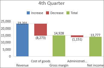
Answer: A waterfall chart is a type of chart that is used to visualize how a value changes from one point to another over time. It can be used to illustrate the cumulative effect of positive and negative values on a total value. It is also known as a bridge chart or a cascade chart. It is typically used to show the cumulative effect of a series of events, such as changes in profits or losses over a period of time.
Question 2: What are the Benefits of Using a Waterfall Chart?
Answer: Waterfall charts can be useful for quickly visualizing how a value changes from one point to another over time. They can help to identify the causes of changes in a value, and can provide insights into how those changes can be managed or prevented. They can also be used to compare the relative impact of different events or factors on a value.
Question 3: How Do You Create a Waterfall Chart in Excel?
Answer: Creating a waterfall chart in Excel is relatively straightforward. First, you will need to create a table of data, including the start and end values, as well as any intermediate values. After entering the data into the table, select the data, then click the Insert tab and select the Waterfall chart option. This will create a basic waterfall chart, which can be customized by adding labels, changing the colors, and adjusting the axes.
Question 4: What Types of Data Can be Used to Create a Waterfall Chart in Excel?
Answer: Waterfall charts can be used to visualize any data that can be represented in a table with multiple rows and columns, including financial data, sales data, and production data. The data should include the start and end values, as well as any intermediate values.
Question 5: What Are Some Tips for Creating an Effective Waterfall Chart in Excel?
Answer: When creating a waterfall chart in Excel, there are a few tips to keep in mind. First, make sure that the data is clearly organized and easy to understand. Second, use color to differentiate between positive and negative values. Third, add labels to each section of the chart to make it easier to interpret. Finally, use consistent formatting throughout the chart to make it more visually appealing.
Question 6: How Can Waterfall Charts Be Used in Business?
Answer: Waterfall charts can be used in a variety of business contexts, including financial analysis, budgeting, and forecasting. They can be used to visualize changes in profits or losses over time, or to compare the relative impact of different events or factors on a value. They can also be used to identify the causes of changes in a value, and to provide insights into how those changes can be managed or prevented.
How to create a waterfall chart in Excel
Creating a waterfall chart in Excel is a great way to visualize your data and track performance over time. Whether you are a beginner or experienced user, the steps and tips provided in this article should help you create a visually appealing and useful waterfall chart. With this chart, you can easily identify and track patterns, trends, and performance over a period of time, making it a valuable tool in data analysis. So, get started and create your waterfall chart in Excel today!
How to Scan a Document Into Microsoft Word?
How to Download and Install Microsoft Word 2016 Free?
Related Posts

Small businesses struggle with ERC tax credit submissions

10 Misunderstandings of the Employee Retention Credit
ERC Tax Credit 2023: Is the ERC tax credit still available?