How to Add Data Bars in Excel?
Do you ever feel like your Excel spreadsheets look a bit dull? Spice them up with data bars! Data bars are a great way to add visual interest to any spreadsheet. They make your numbers easier to read, and they can highlight changes in values over time. In this article, we’ll show you how to add data bars to your Excel spreadsheets in no time.
Data bars are a great way to visualize data in Excel. To add data bars, start by highlighting the range of cells you want to add data bars to. Then right-click and select “Conditional Formatting > Data Bars”. You can customize the data bars to show different colors, lengths, or gradients. When you’re done, the data bars will be visible in the highlighted cells.
Step-by-Step Tutorial:
- Highlight the range of cells you want to add data bars to.
- Right-click and select “Conditional Formatting > Data Bars”.
- Adjust the data bars to show different colors, lengths, or gradients.
- Your data bars will appear in the highlighted cells.
How to Add Data Bars in Excel Spreadsheets
Data bars are a powerful tool that can be used to easily visualize data in Excel spreadsheets. Using data bars, users can quickly identify the highest and lowest values in a range of cells and gain a better understanding of the data. In this article, we will look at how to add data bars in Excel and how to customize them for the most effective visual representation.
Data bars can be added to a range of cells by selecting the range, going to the Home tab, and clicking on Conditional Formatting. Then, select Data Bars from the list and click on the desired color scheme. This will add the data bars to the range and make the data easier to understand.
Customizing Data Bars
Once the data bars have been added, users can customize them to better understand the data. By right-clicking on the data bars, users can select Gradient Fill to make the data bars look slightly different. This can be used to make the data bars stand out more or to make them look less overwhelming.
Users can also make the data bars shorter or longer by right-clicking on them and selecting Show Bar Only. This will make the data bars look thinner or thicker depending on the user’s preference.
Adding Data Bars to Charts
Data bars can also be added to charts in Excel. To do this, first create the chart and then select the data range. Then, click on the Chart Design tab and select Add Chart Element. From the list, select Data Bars and then select the desired color scheme. This will add the data bars to the chart and make the data easier to understand.
Using Data Bars in Pivot Tables
Data bars can also be used in pivot tables in Excel. To do this, first create the pivot table and then select the data range. Then, click on the Analyze tab and select Field Settings. From the list, select Data Bars and then select the desired color scheme. This will add the data bars to the pivot table and make the data easier to understand.
Using Data Bars in Tables
Data bars can also be used in tables in Excel. To do this, first create the table and then select the data range. Then, click on the Design tab and select Table Styles. From the list, select Data Bars and then select the desired color scheme. This will add the data bars to the table and make the data easier to understand.
Using Data Bars in Other Types of Charts
Data bars can also be used in other types of charts in Excel. To do this, first create the chart and then select the data range. Then, click on the Chart Design tab and select Add Chart Element. From the list, select Data Bars and then select the desired color scheme. This will add the data bars to the chart and make the data easier to understand.
Conclusion
Data bars are a powerful tool that can be used to easily visualize data in Excel spreadsheets. By adding data bars to Excel, users can quickly identify the highest and lowest values in a range of cells and gain a better understanding of the data. Furthermore, data bars can also be used in charts, pivot tables, and tables to make the data easier to understand.
Related FAQ
Q1: What is a Data Bar?
A Data Bar is a visual representation of data in a spreadsheet. It’s a bar chart-like feature that takes the values in the cells and creates a bar that can be adjusted in size and color to make it easier to compare values. It can be used to quickly identify values that are out of a certain range, or to help visualize trends in your data.
Q2: How do I add a Data Bar in Excel?
Adding a Data Bar in Excel is simple. First, select the cells that you want to add the Data Bar to. Then, click on the “Conditional Formatting” button in the “Styles” group on the “Home” tab. Next, select “Data Bars” from the list of options. Finally, choose which type of Data Bar you want to add, and the color you want to use for it.
Q3: How do I customize my Data Bar?
You can customize your Data Bar in Excel by clicking on the “More Rules…” option from the “Conditional Formatting” menu. This will open the “New Formatting Rule” window, where you can customize the Data Bar by changing the color, size, and other options. You can also choose to show the Data Bars as a gradient or a solid color.
Q4: Can I add multiple Data Bars to the same cells?
Yes, you can add multiple Data Bars to the same cells in Excel. To do this, click on the “More Rules…” option from the “Conditional Formatting” menu and select “Add Another Rule” from the list of options. This will open up a new window where you can select a different type of Data Bar and customize it as needed.
Q5: Can I add Data Bars to a chart?
Yes, you can add Data Bars to a chart in Excel. To do this, select the chart and then click on the “Conditional Formatting” button in the “Styles” group on the “Home” tab. Next, select “Data Bars” from the list of options and choose which type of Data Bar you want to add. Finally, customize the Data Bar as needed.
Q6: How do I remove a Data Bar from Excel?
To remove a Data Bar from Excel, first select the cells that you want to remove the Data Bar from. Then, click on the “Conditional Formatting” button in the “Styles” group on the “Home” tab. Next, select “Clear Rules” from the list of options and then choose which Data Bar you want to remove. Finally, click “OK” to remove the Data Bar.
How to use Data Bars in Excel
Adding data bars in Excel is an easy and effective way to visualize your data in an engaging way. It is an excellent way to bring out important trends and patterns in your data set. With a few clicks of the mouse, you can quickly and easily make your data look more impressive and easier to interpret. So, if you want to add more visual appeal and clarity to your data set, then adding data bars in Excel is the way to go.
How to Get Z Score in Excel?
How to Copy and Paste a Table Into Excel?
Related Posts

Small businesses struggle with ERC tax credit submissions

10 Misunderstandings of the Employee Retention Credit
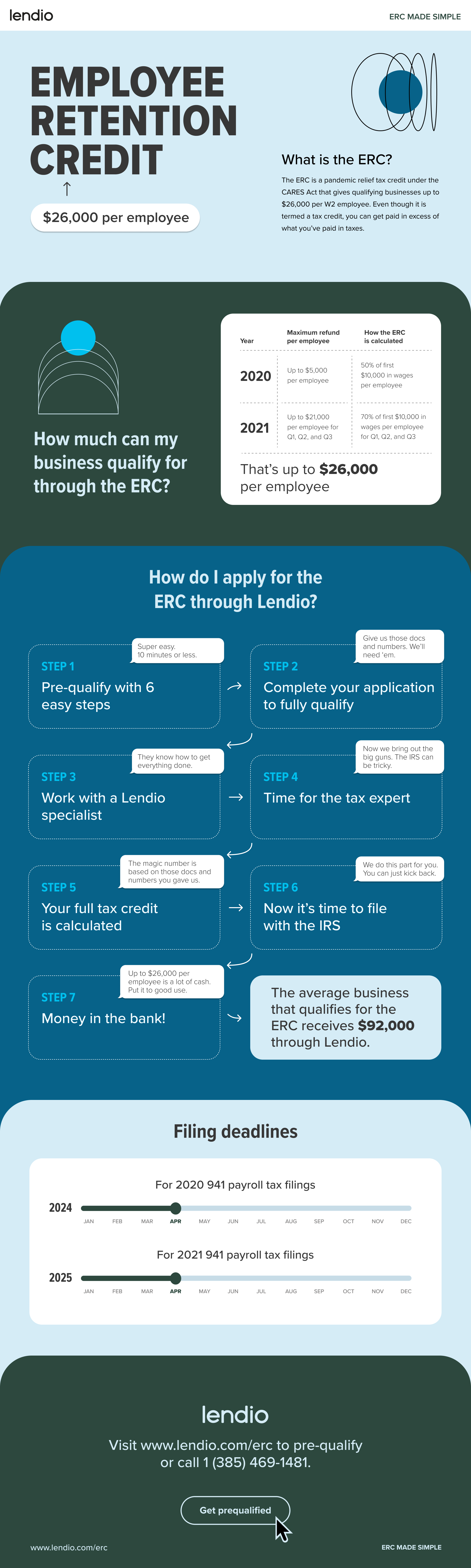
ERC Tax Credit 2023: Is the ERC tax credit still available?