How to Make a Line Graph on Excel?
Creating line graphs on Excel can be a great way to visualize data quickly and effectively. From business professionals to students, Excel is a powerful tool that can help you quickly and easily generate graphs that can be used for presentations, reports, or just for your own data analysis. In this tutorial, we’ll show you how to create line graphs in Excel, from setting up the data to customizing the graph so it looks exactly how you want it to. So, if you’re ready to get started, let’s dive in and learn how to make a line graph on Excel!
Creating a line graph in Microsoft Excel is easy. Simply follow these steps:
- Open Microsoft Excel and create a spreadsheet with your data.
- Highlight the data you want to include on the graph.
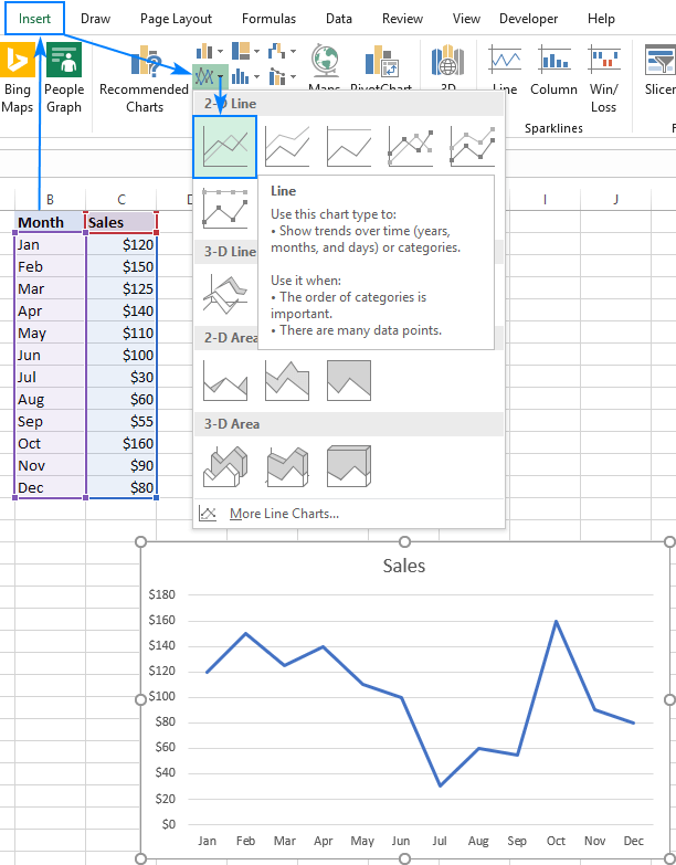
- Click the “Insert” tab and then click “Line” from the Chart section.
- Choose a chart style from the drop-down menu.
- Click “OK” and the graph will appear in the spreadsheet.

How to Create a Line Graph on Microsoft Excel
A line graph is a great way to visualize and compare data over a specific period of time. Microsoft Excel is an excellent tool for creating line graphs and analyzing data. In this tutorial, we will show you how to create a line graph from your data in Excel.
Step 1: Collect Your Data
The first step in creating a line graph is to collect the data you want to graph. This data can be from a survey, an experiment, or any other source. Make sure you have enough data points to create a meaningful graph. Once you have your data, enter it into a spreadsheet in Microsoft Excel.
Step 2: Format Your Data
Once you have your data in the spreadsheet, you need to format it so that Excel understands how to interpret it. Make sure each column has a header, so that Excel knows what that data represents. Also, be sure to use consistent units. For example, if you are recording the temperature of a liquid over time, make sure all temperatures are in degrees Celsius or Fahrenheit.
Step 3: Create the Line Graph
Now that your data is formatted, you can create the line graph. To do this, highlight the data you want to graph and then go to the “Insert” tab. From there, select “Line” and then choose the type of line graph you want to create. You can customize the graph further by adding labels and changing the colors.
Step 4: Analyze Your Data
Once your line graph is created, you can analyze the data it displays. Look for patterns and trends in the data. You can also use the graph to compare data points over time. For example, you might compare the temperatures of two liquids over time to see which one is more stable.
Step 5: Save and Share Your Graph
Once you have analyzed your data, you can save and share your graph. To save the graph, go to the “File” tab and select “Save As”. You can then share the graph with others by sending them the file or by copying and pasting it into a document.
Step 6: Create a Presentation
If you want to present your line graph, you can use Microsoft PowerPoint. To do this, copy and paste the graph into a PowerPoint slide. You can then add text and images to the slide to explain the data and draw attention to key points.
Additional Resources
If you need help creating a line graph in Microsoft Excel, there are many resources available. Microsoft has an extensive help center with detailed tutorials on how to use Excel. Additionally, there are many online tutorials and videos available that can walk you through the process step-by-step.
Related FAQ
Q1: What is a Line Graph?
A line graph is a type of data visualization that shows changes over time or across categories. It is a graphical representation of data that connects individual data points with a line. This allows viewers to easily identify patterns, trends, and correlations between data points. Line graphs are often used to display trends in stock prices, population numbers, and other types of data that change over time.
Q2: How Do I Make a Line Graph in Excel?
Making a line graph in Excel is fairly simple and straightforward. First, open a new Excel spreadsheet or open an existing spreadsheet that contains the data you want to graph. Highlight the data you want to graph, then select the Insert tab and select Line Chart from the Chart group. This will open a new window where you can customize the look of your line graph.
Q3: What Data Should I Use for a Line Graph?
When creating a line graph, it’s important to use data that changes over time or across categories. This could include data such as stock prices, population numbers, sales figures, and more. The x-axis of the line graph should represent the different categories or points in time, while the y-axis should represent the values associated with the categories or points.
Q4: How Do I Format a Line Graph in Excel?
Once you have created your line graph in Excel, you can customize the look of it by selecting the Chart Tools tab and selecting the Design and Format tabs. You can change the chart type, add titles, legends, and data labels, and choose from a variety of colors and line styles. You can also zoom in and out, add a background image, and adjust the axis labels and scales.
Q5: How Do I Add a Trendline to a Line Graph?
A trendline is a line that is drawn on a line graph to show the general direction of the data. To add a trendline to a line graph in Excel, select the chart and select the Chart Tools tab. Then select the Trendline option from the Chart Layouts group. This will open a new window where you can choose the type of trendline you want to add to your graph.
Q6: How Do I Add Data to an Existing Line Graph?
Adding data to an existing line graph in Excel is fairly simple. First, click on the chart and select the Chart Tools tab. Then, select the Select Data option from the Data group. This will open a new window where you can add or remove data from the chart. You can also edit the data labels and legends, as well as change the chart type or the axis labels and scales.
How to Make a Line Graph in Excel
Making a line graph on Excel is easy and straightforward. With just a few clicks and some data, you can create a visually appealing and informative line graph that can be used to analyze trends and compare data. By following these steps, you can make a line graph on Excel in no time.
What Is Onedrive On My Phone?
How To Make Sure Onedrive Is Running?
Related Posts

Small businesses struggle with ERC tax credit submissions

10 Misunderstandings of the Employee Retention Credit
ERC Tax Credit 2023: Is the ERC tax credit still available?