How to Change Y Axis Values in Excel?
Are you trying to figure out how to change the Y-axis values in Excel? If so, you’re not alone. Many Excel users find themselves struggling with this task, and it can be difficult to know where to start. In this article, we’ll provide step-by-step instructions on how to change Y-axis values in Excel and help you get the results you’re after. So, if you’re ready to learn how to make the most of your Excel data, keep reading!
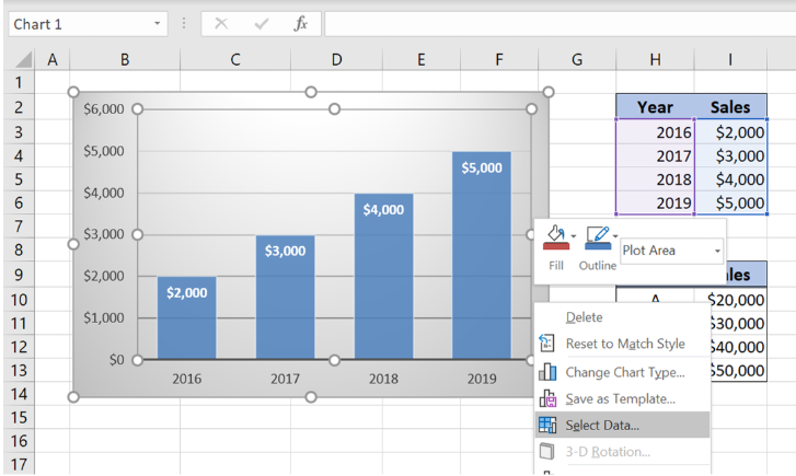
To change the values on the Y-axis of a chart in Excel, follow these steps:
- Open the Excel spreadsheet containing the chart.
- Select the chart and go to the Chart Tools Design tab.
- Click on the “Select Data” command.
- Click on the “Edit” button in the Horizontal (Category) Axis Labels section.
- Choose “Axis Options” and enter new values in the “Minimum” and “Maximum” boxes.
- Click “OK” to apply the new values.

How to Alter Y-Axis Values in Microsoft Excel
The Y-Axis of a graph or chart in Microsoft Excel is the vertical line that runs through the origin point (0,0) and extends to the highest point on the chart. This axis is used to measure the data points that appear on the graph. Depending on the type of graph you are creating, you may need to adjust the Y-Axis values to ensure that the chart accurately reflects the data. This guide will show you how to alter the Y-Axis values of a graph in Excel.
The Y-Axis values of a chart in Excel can be adjusted in a few different ways. The exact method you use will depend on the type of graph you are creating. In this guide, we will cover the methods for adjusting the Y-Axis of a line graph, column chart, and scatter plot.
Changing the Y-Axis of a Line Graph
If you are creating a line graph, the Y-Axis values can be adjusted by following the steps below:
- Right-click the Y-Axis of the graph and select “Format Axis” from the menu.
- In the “Format Axis” window, select the “Axis Options” tab.
- Set the minimum and maximum values for the Y-Axis as desired.
- Click “OK” to apply the changes.
Changing the Y-Axis of a Column Chart
If you are creating a column chart, you can adjust the Y-Axis values by following these steps:
- Right-click the Y-Axis of the graph and select “Format Axis” from the menu.
- In the “Format Axis” window, select the “Axis Options” tab.
- Set the minimum and maximum values for the Y-Axis as desired.
- Click “OK” to apply the changes.
Changing the Y-Axis of a Scatter Plot
If you are creating a scatter plot, you can adjust the Y-Axis values by following these steps:
- Right-click the Y-Axis of the graph and select “Format Axis” from the menu.
- In the “Format Axis” window, select the “Axis Options” tab.
- Set the minimum and maximum values for the Y-Axis as desired.
- Click “OK” to apply the changes.
Related FAQ
1. How do I change the Y Axis values in Excel?
To change the Y axis values in Excel, select the chart, then click the “Format” tab in the Chart Tools section. From here, you can select the “Vertical Axis” option to adjust the Y axis values. In the Axis Options tab, you can select the type of axis you’d like (date, text, numeric). You can also change the value range, the minimum and maximum values, and the number of intervals you’d like to display on the chart. Finally, click “OK” to apply the changes.
2. How can I change the scale of the Y axis?
To change the scale of the Y axis, first select the chart, then click the “Format” tab in the Chart Tools section. From here, you can select the “Vertical Axis” option. In the Axis Options tab, you can select the type of axis you’d like (date, text, numeric), as well as change the value range, the minimum and maximum values, and the number of intervals you’d like to display on the chart. You can also choose to set the axis to automatically adjust the scale to fit the data. Finally, click “OK” to apply the changes.
3. How do I add a secondary Y axis in Excel?
To add a secondary Y axis in Excel, select the chart and click the “Format” tab in the Chart Tools section. From here, you can select the “Axes” option and select the “Secondary Axis” option. You can then adjust the scale of the secondary Y axis in the same way as the primary Y axis. Finally, click “OK” to apply the changes.
4. How do I reverse the order of the Y axis in Excel?
To reverse the order of the Y axis in Excel, select the chart, then click the “Format” tab in the Chart Tools section. From here, you can select the “Vertical Axis” option to adjust the Y axis values. In the Axis Options tab, you can scroll down to the “Axis Options” section and select the “Categories in reverse order” checkbox. Finally, click “OK” to apply the changes.
5. How do I add labels to the Y axis in Excel?
To add labels to the Y axis in Excel, select the chart, then click the “Format” tab in the Chart Tools section. From here, you can select the “Vertical Axis” option to adjust the Y axis values. In the Axis Options tab, you can scroll down to the “Axis Labels” section and select the “Category Name” option. You can also add a custom label by entering the text in the “Custom” box. Finally, click “OK” to apply the changes.
6. How do I change the position of the Y axis in Excel?
To change the position of the Y axis in Excel, select the chart, then click the “Format” tab in the Chart Tools section. From here, you can select the “Vertical Axis” option to adjust the Y axis values. In the Axis Options tab, you can scroll down to the “Position” section and select either the “On Tick Marks” or “Between Tick Marks” option. Finally, click “OK” to apply the changes.
Change the Vertical Y Axis Start or End Point in Excel – Excel Quickie 37
Changing Y Axis Values in Excel can be a useful tool for creating more informative and visually appealing graphs. With a few simple steps, you can easily customize your Y Axis values in Excel to better suit your needs. Whether you’re a novice or an experienced user, this guide should help you get the most out of Excel’s Y Axis customization options. With the right techniques, you can make the most of your data and create insightful graphs that will make your data come alive!
How to Change X Axis Labels in Excel?
How to Change X Axis Labels in Excel?
Related Posts

Small businesses struggle with ERC tax credit submissions

10 Misunderstandings of the Employee Retention Credit
ERC Tax Credit 2023: Is the ERC tax credit still available?