How to Make a Histogram Excel?
Are you wanting to learn how to make a histogram in Microsoft Excel? If so, you’ve come to the right place! In this article, we’ll walk you through the steps to easily create a histogram to represent your data in a visually appealing way. We’ll cover how to set up the histogram, how to customize it, and how to interpret the results. With our help, you’ll be able to make a histogram in Excel quickly and easily!
Creating a Histogram in Microsoft Excel
To create a histogram in Microsoft Excel, follow these steps:
- Open a spreadsheet in Excel and enter the data into columns.
- Highlight the data and select the “Charts” tab.
- Under the “Insert” tab, select “Histogram” and choose the desired chart.
- Enter a chart title and axis labels.
- Choose the range and bin numbers for the histogram.
- Finally, click “OK” to generate the histogram.

Introduction to Creating Histograms in Excel
Histograms are used to represent the frequency of data within a given range. They are helpful for visualizing data quickly and easily, making them a great tool for data analysis in Excel. In this article, you’ll learn how to create a histogram in Excel and how to customize it to make it more useful.
Histograms are a great way to quickly visualize your data. Excel provides several methods for creating histograms, depending on the type and amount of data you have. You can create a histogram from a set of numbers, from a list of values, or from a pivot table.
Creating a Histogram from a Set of Numbers
The simplest way to create a histogram is from a set of numbers. To do this, select the data you wish to use and click the “Insert” tab. Select the “Histogram” option from the chart group. This will open the “Insert Chart” dialog box. Select “Histogram” from the list of chart types, and then click “OK.”
Once you have created the chart, you can customize it to make it more useful. To do this, select the chart and click the “Design” tab. Here, you can select the data series, the type of chart, and the range of the data. You can also customize the colors and labels used in the chart.
Adding Data Labels
If you would like to add data labels to your histogram, select the chart and click the “Layout” tab. In the “Data Labels” group, select the “More Data Label Options” option. This will open the “Data Labels” dialog box.
In this dialog box, you can customize the data labels. You can choose to show the data values, percentages, or both. You can also customize the font, size, and color of the labels. Once you have finished customizing the labels, click “OK” to apply the changes.
Adding a Trendline
A trendline can be added to a histogram to help visualize the data’s overall trend. To add a trendline, select the chart and click the “Layout” tab. In the “Analysis” group, select the “Trendline” option. This will open the “Trendline Options” dialog box.
In this dialog box, you can select the type of trendline you would like to add. You can also customize the line’s color, width, and labels. Once you have finished customizing the trendline, click “OK” to apply the changes.
Creating a Histogram from a List of Values
If you have a list of values, you can create a histogram from those values. To do this, select the data and click the “Insert” tab. Select the “Histogram” option from the chart group. This will open the “Insert Chart” dialog box. Select “Histogram” from the list of chart types, and then click “OK.”
Once you have created the chart, you can customize it to make it more useful. To do this, select the chart and click the “Design” tab. Here, you can select the data series, the type of chart, and the range of the data. You can also customize the colors and labels used in the chart.
Adding a Data Series
If you would like to add a data series to your histogram, select the chart and click the “Design” tab. In the “Data” group, select the “Select Data” option. This will open the “Select Data Source” dialog box.
In this dialog box, you can select the data series you would like to add. You can also customize the labels used for each data series. Once you have finished customizing the data series, click “OK” to apply the changes.
Adding a Title
If you would like to add a title to your histogram, select the chart and click the “Layout” tab. In the “Labels” group, select the “Chart Title” option. This will open the “Chart Title” dialog box.
In this dialog box, you can enter a title for your chart. You can also customize the font, size, and color of the title. Once you have finished customizing the title, click “OK” to apply the changes.
Top 6 Frequently Asked Questions
1. What is a Histogram?
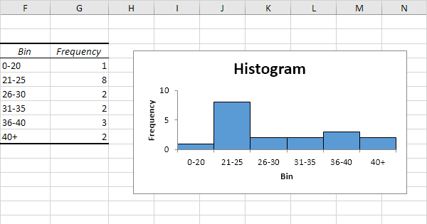
A histogram is a chart that displays statistical information by using rectangular bars to represent different values. It is used to show the frequency of data within a certain range of values. The height of each bar represents the number of times the data falls within the range represented by the bar. Histograms are useful for displaying the distribution of data and can be used to compare different sets of data.
2. How Do You Make a Histogram in Excel?
Making a histogram in Excel is a simple process. First, enter your data into an Excel worksheet. Then, select the data and choose the Insert tab. Under the Charts section, select the Histogram option. A new window will appear prompting you to select the data range you want to use for your histogram. After choosing the data range, select the Chart Layout tab and customize the look of your histogram. Finally, click OK to create the histogram.
3. What Are the Different Types of Histograms?
There are two types of histograms: single and multiple. A single histogram shows the distribution of a single set of data. A multiple histogram shows the distribution of multiple sets of data. Multiple histograms can be used to compare different sets of data and visualize their differences.
4. What Are the Benefits of Using a Histogram?
Histograms are useful for visualizing data and displaying information in a straightforward way. They can be used to compare different sets of data and to analyze the distribution of data. They are also useful for highlighting trends and making predictions.
5. How Can You Make the Histogram More Readable?
Making the histogram more readable can be done by adjusting the chart’s layout. For example, you can change the color, font size, and style of the labels, as well as the axis titles. You can also adjust the width of the bars to make the data easier to read. Additionally, you can add a trend line or an average line to the chart to make it easier to interpret the data.
6. How Do You Add Labels to a Histogram?
Adding labels to a histogram is relatively easy. First, select the chart and go to the Chart Layout tab. Under the Labels section, select the Data Labels option. A new window will appear prompting you to select the data labels you want to add. You can choose to add labels to the bars, the data points, or both. Once you have selected the labels you want to add, click OK to apply them to the chart.
Mat 144 – How to Create Histogram in Excel.
Creating a histogram in Excel does not have to be a difficult and time-consuming process. With the use of the built-in histogram tool, you can quickly and easily create a visually appealing graph in a few simple steps. The histogram allows you to quickly identify patterns and trends in your data, allowing you to make informed decisions about your data. By following the instructions outlined in this article, you can easily create a histogram in Excel that is both informative and visually appealing.
How to Select a Column in Excel?
How to Setup Sftp Server on Windows?
Related Posts

Small businesses struggle with ERC tax credit submissions

10 Misunderstandings of the Employee Retention Credit
ERC Tax Credit 2023: Is the ERC tax credit still available?