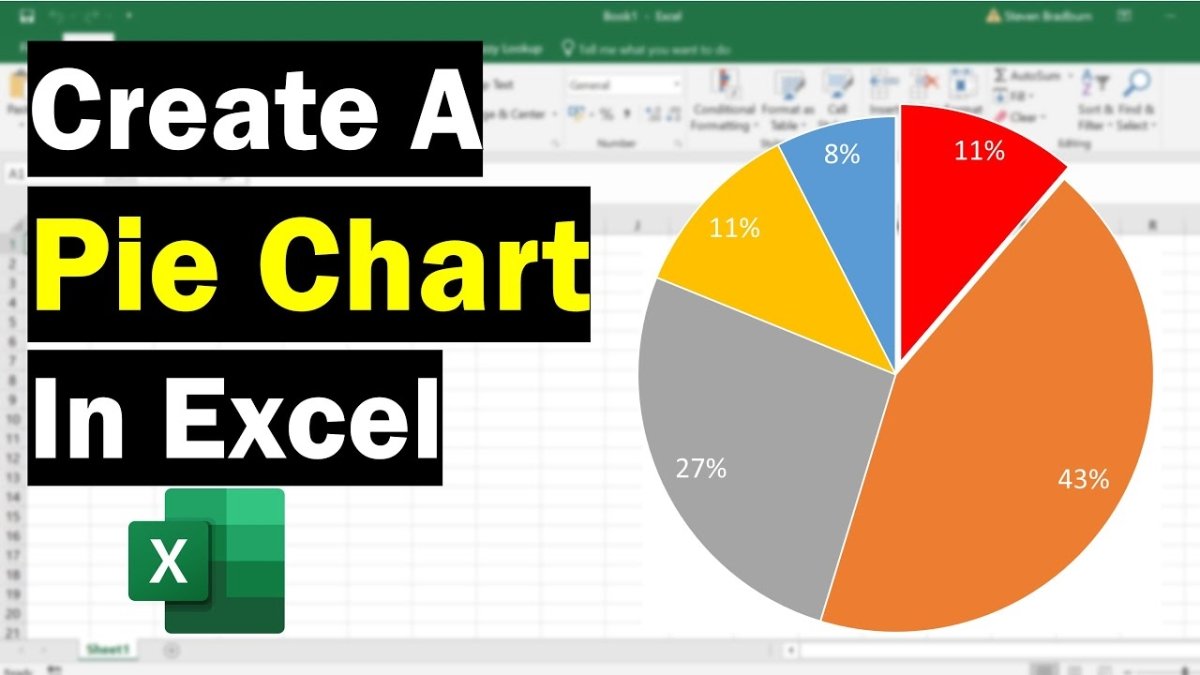
How to Create Pie Chart in Excel?
Are you looking for an easy and straightforward way to create a pie chart in Microsoft Excel? Pie charts are an effective way to compare data and visualize information. This tutorial will teach you how to create a pie chart in Excel in just a few simple steps. With this guide, you will be able to easily create and customize a pie chart in Excel without any trouble. So, let’s get started!
Creating a Pie Chart in Excel is easy! Here are the steps to make one:
- Launch Excel and open the spreadsheet with your data.
- Highlight the data you want to include in the chart.
- Select the Insert tab, then choose Pie from the Charts group.
- Choose the type of pie chart you’d like to make.
- Select your data and click Insert.
- Your chart should appear on the spreadsheet.
You can also customize your chart by adding a title, changing the color, adding data labels, and more.

How to Make a Pie Chart in Microsoft Excel
Making a pie chart in Microsoft Excel is a fairly simple process. Pie charts are used to display the relationship of a set of values to the total amount. Pie charts are used to compare parts of a whole in visual form, making them an effective way to show how different values can contribute to a total.
Step 1: Prepare Your Data
Before you can create a pie chart, you must first prepare your data. Make sure that all your data is organized in columns, with labels for each column. The labels should be descriptive and easily recognizable. The data should also be numerical and contain only one value per cell.
Step 2: Select Your Data
Once your data is prepared, you can select the data you want to include in your pie chart. To select your data, click and drag your mouse over the data. Make sure that the data is contiguous and that all the cells containing the data are selected.
Step 3: Insert the Pie Chart
Once your data is selected, you can insert the pie chart. To do this, go to the Insert tab in the ribbon and click on the Pie Chart icon. A menu will appear with several different types of pie charts that you can choose from. Select the one you want to use and click OK.
Step 4: Customize the Chart
Once the chart is inserted, you can customize it to your liking. You can choose from a variety of options to make your chart look the way you want it to. You can change the colors, add labels, select a data series to display, and more.
Step 5: Finalize the Chart
Once you’ve customized the chart to your liking, you can finalize it. To do this, go to the Design tab in the ribbon and click on the Chart Layout icon. From there, you can select the option to add a title, add labels, and more.
Step 6: Save and Print
Once you’ve finalized the chart, you can save and print it. To do this, go to the File tab in the ribbon and click on the Save As option. Select the location where you want to save the file and click Save. You can also click on the Print option in the File tab to print the chart.
Related FAQ
Question 1: What is a Pie Chart?
A Pie Chart is a circular chart that displays the relative sizes of different data categories. In a pie chart, the arc length of each slice (and consequently its central angle and area), is proportional to the quantity it represents. Pie charts are an effective way to compare and contrast different values or categories in a dataset.
Question 2: How do I Create a Pie Chart in Excel?
Creating a Pie Chart in Excel is easy. First, open your workbook and select the data you want to use to create the chart. Then, go to the Insert tab and select the Pie Chart option. You will be given the choice of several different types of pie charts. Select the one that best fits your data set and click “OK”. From there, you can customize the chart to fit your needs.
Question 3: What are the Different Types of Pie Charts Available?
There are several different types of pie charts available in Excel. The most common types are 2D, 3D, Exploded, Doughnut, and Pie of Pie. The 2D and 3D pie charts display the data in a traditional pie chart format. The Exploded chart displays the segments of the chart in a more separated manner, making it easier to compare each slice. The Doughnut chart displays the data in a circle with a hole in the center. The Pie of Pie chart displays data in a nested pie format, making it easier to compare smaller slices.
Question 4: What Formatting Options Are Available for Pie Charts?
In Excel, you can customize the formatting of your pie chart. You can change the color of each slice, the size of the chart, the labels and the font style. You can also customize the legend, add or remove lines, or add data labels to each slice.
Question 5: How Can I Use a Pie Chart to Analyze Data?
A pie chart can be used to analyze data in a number of ways. It can be used to compare the relative sizes of different data categories, or to compare the contribution of each data category to the whole. You can also use a pie chart to compare the distribution of data over time or to see how a single data point has changed over time.
Question 6: What Are the Benefits of Using a Pie Chart?
Pie charts are a great visual tool for comparing the relative sizes of different data categories. They can be used to quickly and easily illustrate the relative contribution of each data category to the whole. Pie charts also allow you to compare multiple data sets at once, making it easy to identify patterns and trends.
How to Make a Pie Chart in Excel
Creating a pie chart in Excel can be a great way to provide a visual representation of your data. With a few simple steps, you can easily create an attractive and informative pie chart that can be used to effectively illustrate your data. Whether you’re a student, an analyst, or a manager, this tutorial will help you quickly and easily create a pie chart in Excel.
How to Schedule a Meeting in Microsoft Teams?
What Is The Difference Between Sharepoint And Onedrive?
Related Posts

Small businesses struggle with ERC tax credit submissions

10 Misunderstandings of the Employee Retention Credit

ERC Tax Credit 2023: Is the ERC tax credit still available?