How to Combine Two Charts in Excel?
Are you trying to make your data more visually appealing? Combining two charts in Excel can help you create an informative, visually appealing presentation of your data. In this guide, we’ll cover the basics of how to combine two charts in Excel and the various ways to customize your combined charts. We’ll also provide some tips for creating charts that are both informative and attractive. Let’s jump in and learn the basics of how to combine two charts in Excel!

Combine Excel Charts to Create Visualizations
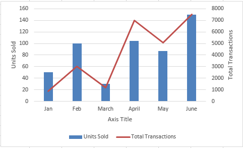
Excel charts are a great way to visually represent data. They can be used to help readers understand the data being presented and to draw attention to key points. However, sometimes it can be difficult to get the most out of the data when combining multiple charts. Combining two charts in Excel can help to give a clearer picture of the data and can be done in just a few steps.
When combining two charts in Excel, the easiest way to do so is to use the “combine charts” feature. This feature allows users to quickly merge two charts into one. The combined chart will contain both sets of data, but will be displayed in a single chart. This makes it easier to compare the data and draw conclusions from the data.
When combining charts, it is important to make sure that the data being used is compatible. If the data is not compatible, the result will be a distorted chart. Therefore, it is important to check that the data is compatible before combining two charts.
Steps to Combine Charts in Excel
Combining two charts in Excel is a simple process. The first step is to select the two charts that you want to combine. This can be done by clicking on each chart and then holding down the “Ctrl” key while clicking on the other chart. This will select both charts.
Once the two charts are selected, the “combine charts” option can be found in the “format” tab of the ribbon. Clicking on this option will open up a dialog box that will allow you to specify the type of chart you want to create. Once the type of chart has been selected, click “ok” to combine the two charts.
Tips for Combining Excel Charts
When combining two charts in Excel, it is important to keep the following tips in mind:
1. Choose Compatible Data
As mentioned previously, it is important to make sure that the data being used is compatible. If the data is not compatible, the result will be a distorted chart.
2. Use the Same Axis Scale
When combining two charts, it is important to make sure that the axis scales are the same. This will ensure that the data is accurately represented in the combined chart.
3. Use the Same Chart Type
It is also important to make sure that the two charts are of the same type. For example, if one chart is a bar chart, the other chart should also be a bar chart.
Conclusion
Combining two charts in Excel is a great way to get the most out of the data. By following the steps outlined above and keeping the tips in mind, users can easily combine two charts in Excel to create a clearer picture of the data.
Frequently Asked Questions
Q1. How do I combine two charts in Excel?
A1. To combine two charts in Excel, you need to first create the two separate charts. Once you have the two charts made, go to the chart that you want to appear first. Right-click it and select “Copy” from the menu. Then, select the second chart and right-click it, selecting “Paste.” This will attach the first chart to the second one. You can adjust the size and positioning of the charts as necessary. If desired, you can also add data labels and other information to the chart. Once you’re finished, you’ll have a single chart containing both sets of data.
Q2. What is the benefit of combining two charts in Excel?
A2. Combining two charts in Excel can provide a more comprehensive view of your data. This can be helpful when you’re trying to compare data sets side-by-side or when you’re trying to show relationships between different sets of data. It also makes it easier to draw conclusions from your data by providing a more detailed visual representation.
Q3. What types of charts can be combined in Excel?
A3. You can combine any two types of charts in Excel. This includes bar charts, line charts, column charts, pie charts, and scatter charts. You can also combine charts of different types. For example, you could combine a bar chart and a line chart to show how two different sets of data interact.
Q4. How are combined charts formatted?
A4. Combining two charts in Excel will result in a single chart with two distinct sets of data. The formatting options for the combined chart will depend on the type of chart. For example, if you’re combining two line charts, you can adjust the line thickness, color, and other attributes for each chart. You can also adjust the overall size and positioning of the chart.
Q5. Can I add labels to a combined chart?
A5. Yes, you can add labels to a combined chart. To do so, select the chart and then click the “Add Data Labels” button in the “Chart Tools” menu. This will add labels to the chart, which can help to clarify the meaning of the data. You can also adjust the font, color, and size of the labels as needed.
Q6. Can I add legends to a combined chart?
A6. Yes, you can add a legend to a combined chart. To do so, select the chart and then click the “Add Legend” button in the “Chart Tools” menu. This will add a legend to the chart, which will help to identify the different sets of data represented in the chart. You can also adjust the font, color, and size of the legend as needed.
MS Excel – Combining Two Graphs Into One! Cool Trick!
In conclusion, combining two charts in Excel is a great way to present complex data in a visually appealing way. It also allows you to present information in a more organized manner, which can help simplify complex data sets. With the right tools and knowledge, you can easily combine two charts in Excel and create an effective visualization of your data. With just a few clicks, you can create an effective and eye-catching presentation with two charts in Excel.
How to Consolidate in Excel?
How to Delete Unused Columns in Excel to Reduce Size?
Related Posts

Small businesses struggle with ERC tax credit submissions

10 Misunderstandings of the Employee Retention Credit
ERC Tax Credit 2023: Is the ERC tax credit still available?