How to Add Error Bars in Excel?
Excel is a powerful tool for data analysis and visualization. Adding error bars to your Excel charts can provide valuable information about the accuracy of your data. Error bars are graphical representations of the uncertainty in your data and can be used to indicate the range of possible results. In this tutorial, you will learn how to add error bars to your Excel charts, so you can make more informed decisions about your data.
- Step 1: Select the chart
- Step 2: Click the Chart Elements button
- Step 3: Select the Error Bars checkbox
- Step 4: Select the type of error bar
- Step 5: Enter the value of the error bar
- Step 6: Click the OK button

What are Error Bars?
Error bars are a graphical representation of the variability of the data, and are used on graphs to indicate the error or uncertainty in a reported measurement. They give a general idea of how accurate a measurement is, or conversely, how far from the reported value the true (error free) value might be. Error bars can be added to Excel graphs using the “Error Bars” function in the “Chart Elements” menu.
Error bars can also be used to compare the ranges of two or more data sets. They are typically shown as two vertical lines, with the higher line representing the maximum value and the lower line representing the minimum value. The lines indicate the range of data within which the true value of the measurement is likely to fall.
Types of Error Bars
Error bars come in two types: standard and custom. Standard error bars are used to indicate the standard error of the mean, which is the standard deviation divided by the square root of the sample size. Custom error bars are used to indicate the range of values that the true value of the measurement is likely to fall within.
Adding Standard Error Bars in Excel
To add standard error bars in Excel, select the chart and then click on the Chart Elements button on the ribbon. Select the Error Bars option and choose the standard error option. Then click on the Error Bars tab and select the type of error bars you want to display.
Adding Custom Error Bars in Excel
To add custom error bars in Excel, select the chart and then click on the Chart Elements button on the ribbon. Select the Error Bars option and choose the custom option. Then click on the Error Bars tab and select the type of error bars you want to display. In the Custom Error Bars dialog box, enter the values for the Minimum, Maximum and Error Amount fields.
Formatting Error Bars in Excel
Error bars can be formatted to display the standard error, the standard deviation, or the percentage of the standard deviation. To format the error bars, select the chart, click on the Chart Elements button on the ribbon, and then select the Error Bars tab. Select the type of error bars you want to display, and then select the type of formatting you want to use.
Using Error Bars to Compare Data Sets
Error bars can be used to compare the ranges of two or more data sets. To do this, select the chart, click on the Chart Elements button on the ribbon, and then select the Error Bars tab. Select the type of error bars you want to display, and then select the data sets you want to compare. The error bars will then indicate the range of values within which the true value of the measurement is likely to fall.
Top 6 Frequently Asked Questions
Q1. What Are Error Bars in Excel?
Error bars in Excel are graphical representations of the variability in data that is plotted in a chart. They are used to indicate the degree of uncertainty of the data associated with each data point on the chart. Error bars can represent standard deviation, percentage, or standard error, among other types of error data. They are helpful in providing a visual representation of the uncertainty of the data, which can be useful in making decisions based on the data.
Q2. What Type of Graph Should I Use to Represent Error Bars in Excel?
The most common type of graph used to represent error bars in Excel is a line graph. Line graphs are well-suited to displaying error bars because they allow the user to easily compare the error data to the actual data points. Other types of graphs, such as bar graphs and scatter plots, can also be used to display error bars, but line graphs are the most common.
Q3. How Do I Add Error Bars to a Graph in Excel?
Adding error bars to a graph in Excel is relatively simple. First, select the graph and then click the “Design” tab on the ribbon. Then, select the “Add Chart Element” button and select “Error Bars” from the menu. From here, you can select the type of error bars you want to add to the graph, as well as the direction of the error bars.
Q4. What Options Are Available for Customizing Error Bars in Excel?
When customizing error bars in Excel, you have a few options. You can adjust the size of the error bars, the color of the error bars, the direction of the error bars, and the type of error bars. Additionally, you can add error labels to the error bars, which can be helpful in providing more information about the data represented by the error bars.
Q5. How Do I Edit an Existing Set of Error Bars in Excel?
To edit an existing set of error bars in Excel, you must first select the graph or chart containing the error bars. Then, click the “Design” tab on the ribbon, then select the “Add Chart Element” button, and select “Error Bars” from the menu. This will open the Error Bar dialog box, where you can make the desired changes to the existing error bars.
Q6. How Do I Remove Error Bars from a Graph in Excel?
To remove error bars from a graph in Excel, you must first select the graph or chart containing the error bars. Then, click the “Design” tab on the ribbon, then select the “Add Chart Element” button, and select “Error Bars” from the menu. This will open the Error Bar dialog box, where you can uncheck the “Display error bars” box to remove the error bars.
How To Add Error Bars In Excel (Custom Error Bars)
Error bars in Excel can be an effective way to display the variance in your data. They allow for easy visualization of the range of data points, as well as highlighting any outliers. By following the steps outlined in this article, you can quickly and easily add error bars to your Excel graph. With this simple technique, you can easily enhance your spreadsheet visuals and make your data more interpretable.
How to Fix Yellow Screen on Windows 10?
How to Fix Lag on Pc Games Windows 10?
Related Posts

Small businesses struggle with ERC tax credit submissions

10 Misunderstandings of the Employee Retention Credit
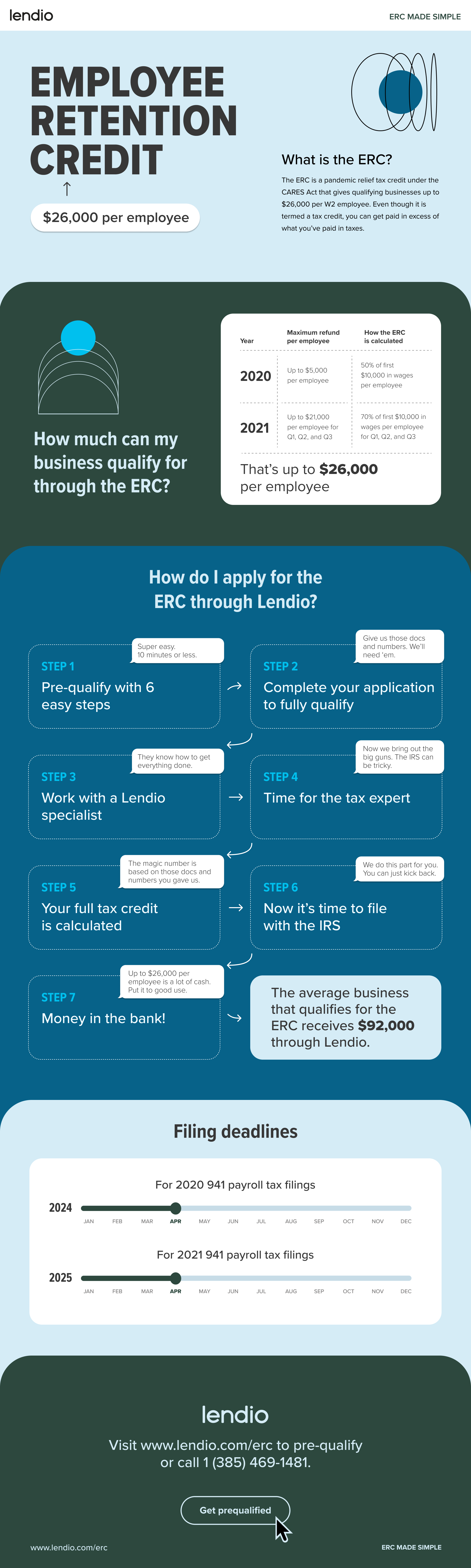
ERC Tax Credit 2023: Is the ERC tax credit still available?